Playing Tetris by ear: metaphor, metonym, and the small palette of audible meaning
Originally shared on LinkedIn (opens in a new window), 2026-07-26.
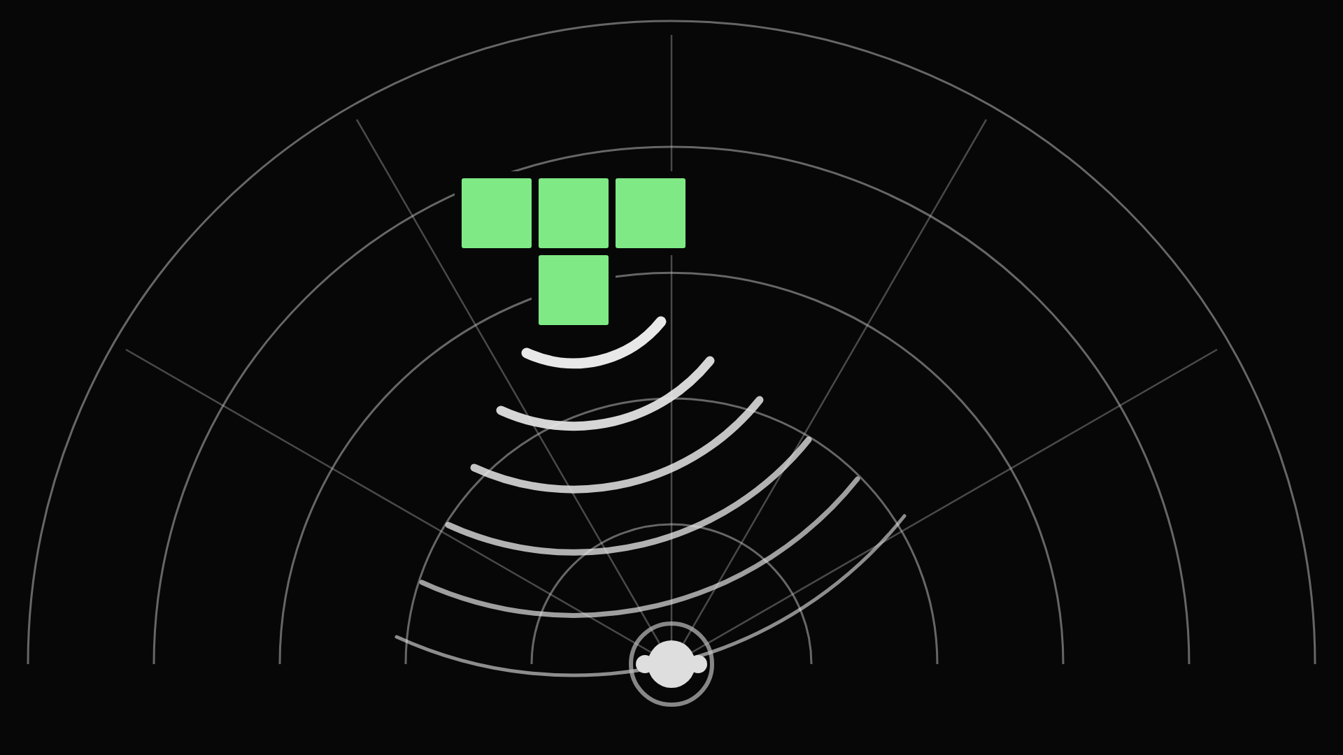
Article based on the full case study: Accessible Tetris
On accessibility, auditory display, and what it takes to render a real-time visual game for blind and low-vision players when description is not enough.
A screen reader pointed at Tetris can say the score. It cannot say the game.
That sentence took me a long time to earn, and it is still the most useful thing I know about the limits of assistive technology. The score is a number in a box. The game is a falling shape, two columns left of a gap it might fit, descending faster than it was a minute ago, above a landscape whose surface the player has been building for the last four minutes and can see at a glance. One of those is a label. The other is a spatial judgement made continuously under time pressure, and there is no field anywhere in the interface that holds it.
I came at this from an odd direction. My doctoral work in the 2000s was about adaptation: the idea that an application should be built over an abstract model of itself, rendered to meet user need and preference using whatever design space suits the person using it; a rendering service that consumes that model rather than an overlay layer bolted on afterwards. That model is CISNA, the model of accessible adaptive hypermedia I published at W4A in 2008, and it is the core of the thesis. It rebuilds the Dexter Reference Model of hypertext into five layers: Adaptation, Navigation, Semantics, Inventory, and External Content. Tetris was one of the case studies I chose to test it against. I chose it because it is hard, not because it looked achievable. If a claim about accessible rendering is worth anything, it should be made to prove itself somewhere uncomfortable.
What I did not expect was that the interesting part of the problem would turn out to be a problem of rhetoric.
The document metaphor, and the absence of one
The first thing that struck me, working on Tetris as a developer, was how naked I felt without HTML. On the web I had a document metaphor to think in: headings, paragraphs, tables, lists, divisions. Those are not merely markup. They are a shared vocabulary of structure that both the author and the assistive technology already understand, and everything a screen reader does well rests on that shared understanding.
Games have no equivalent. There is no agreed vocabulary for describing what a game is doing, so the first job was to build one: cockpit and head-up display, immersive and observational, sprite-based animation, grid and canvas playing areas, gravity, history, elapsed time. Ordinary words, but the exercise mattered, because that taxonomy is what an adaptive renderer selects against. You cannot choose a rendering to suit a person until you can state what the content actually is.
Notice that every one of those terms is a figure of speech. A cockpit is not a cockpit. Gravity in Tetris is not gravity; nothing is being attracted to anything. A "head-up display" is borrowed from aviation, which borrowed it from gunsights. Interfaces are made of figures, and this is not a quirk of games. The desktop metaphor organises data. Traffic-light colours present line quality. A scrollbar presents relative position. Most interfaces yield up a large number of figures on inspection, with no guarantee of consistency between them: "pages" in a browser and "pages" in a word processor behave quite differently under zoom, and nobody finds this strange.
This is the thing conventional assistive technology cannot follow. A screen reader works by automated transliteration, converting a default presentation into one that suits the user, and its success depends on how well it interprets that default presentation, including whatever is carried by figure alone. As Barbosa put it, the appropriateness and sophistication of interpretations is directly proportional to the expressiveness of the underlying domain models. To interpret an application's figures, a screen reader would need the domain model of the platform and of every application running on it. In practice it cannot have them. So it transliterates the well-known figures of the host platform and little else, and content carried by relative geometry or scalar representation is largely lost. In terms of web development, think the WAI Aria APG.
Hold Tetris up against that machinery and nearly everything that matters is the kind of content transliteration loses. The silhouette is relative geometry. The fit between piece and gap is proximal, spatial and continuous. Urgency is carried by animation timing. Hence the score, and not the game.
The seven dimensions of audible meaning
Before deciding how to say something in sound, it is worth being blunt about how much sound can say.
While a Tetris piece is falling, a player needs at least five things at once: the identity and orientation of the falling tile, its horizontal position, its distance from the landscape below, the shape of the landscape where it is going to land, and how much time remains before it locks. A sighted player takes all five in a single glance, repeatedly, without effort, and the display holds all five simultaneously and persistently, so any of them can be re-checked at will.
Condensed to one sentence, that is the whole accessibility problem: vision is a parallel medium and sound is a serial one. Any sonic rendering must ration what it says.
So what is actually available to ration? Setting aside speech, which is expensive in time and attention, the dimensions of sound that an untrained listener decodes reliably are few:
- Azimuth, the left-right position of a source. This is the strongest of the lot, and the one that needs no explanation to anybody.
- Pitch, high and low, which maps readily onto up and down, more and less, and near and far.
- Loudness, which reads as proximity or as insistence.
- Tempo and pulse rate, which read as urgency almost universally.
- Timbre, the character of a sound, which carries identity and category: this is a different kind of thing from that.
- Consonance and dissonance, which read as resolved and unresolved, settled and unsettled, good and bad.
- Voice identity, a speaker being recognisably a different speaker, which sorts information into streams without a word being spent on saying so.
And then the weak ones.
- Elevation, the height of a source, is far coarser than people expect: perhaps five distinguishable bands, not the twenty rows of a Tetris well.
- Reverberation and brightness suggest distance and enclosure, but vaguely.
- Front and back are close to unusable over headphones, because the brain resolves front from back largely through small head movements, and somebody sitting at a screen with headphones on does not make them reliably.
That is roughly seven dependable dimensions, delivered in series, against a visual display that offers position in two dimensions, colour, size, shape, texture, motion and persistence, all in parallel and all continuously available. The asymmetry is not a detail. It is the design constraint that generates everything else.
My original build for Tetris makes the point in miniature. The whole soundscape was barely a dozen wav samples deep: spoken letters and numbers, water sounds, a set of notes. A dozen samples doing the work of a screenful of pixels.
Why sound forces you into figures of speech
Those constraints mean that there is far more to say than there are literal channels to say it in. So you cannot transliterate. You have to make one thing stand for another, and the figure you choose is not decoration laid over the interface. It is the interface, and it is doing compression.
Rhetoric has careful names for the ways one thing stands for another, and the distinctions turn out to be practical rather than academic.
- Metaphor works by mapping across domains on the basis of resemblance. Something in the target behaves like something in the source, and the listener transfers the structure. Falling water for a falling tile is metaphor.
- Metonym works by association and contiguity rather than resemblance. The thing that stands in is not similar to what it represents; it is connected to it, adjacent to it, part of its world. The crown for the monarchy. A different voice for a different category of information. Its close relative synecdoche substitutes a part for the whole, which is what a footstep does when it represents a person walking.
- Allegory is not a single substitution at all. It is a sustained frame in which many substitutions cohere, a whole small world within which the individual mappings make sense together, and, importantly, within which the listener can reason.
To these three I would add the case that is not a figure at all, and which turns out to be the most instructive: the literal mapping, where a thing simply is itself. Direction represents direction. Distance represents distance. The auditory display field has long had a version of this distinction, separating sounds that resemble their source from sounds that stand in by pure convention. What the Tetris work suggested to me is that the interesting boundary is not between resemblance and convention. It is between the literal and the figurative.
My seven audio metaphors for Tetris, and how each one fared
I devised seven audio devices for the original build. Here they are with the field notes attached, and with the honest verdicts, because the failures taught me more than the successes.
- Gravity as waterfall. The action of falling, and how far there is left to fall, inside an already busy soundscape. I used falling water, with volume and pitch manipulated over time so the water feels nearer as the tile descends. I first implemented it as an ambient sound and later as a point source, and there was a qualitative difference in the point source's favour: moving the location beats merely swelling the volume. This is metaphor at its most effective, and it worked outright. It asks nothing of the player, because everybody already knows what approaching water means. That is the tell. The best metaphors are the ones grounded in bodily experience the listener acquired long before they met your interface.
- Musical sonar. I needed to express the quality of the tessellation between the falling tile and the ground. I play one note for each column of the tile's width, in sequence, around the listener; the phrase repeats every couple of seconds, or whenever the player moves or rotates the piece. The higher the note, the better the fit. This is metaphor too, but of a more demanding kind, because sonar is not an experience most people have had. It worked surprisingly well once you got the idea, and that clause is doing a lot of work: new listeners took quite a while to understand it. A training mode belongs in any future version. Metaphor drawn from something the listener knows only by description has to be taught.
- Aside. I whisper the next tile and the contents of the hold box into the player's right ear. The figure here is theatrical: an aside is a convention for saying something to one side of the main action, and the listener who knows that convention knows immediately how much attention this stream deserves. It is metonymic rather than metaphorical, because a whisper does not resemble low-priority information; it is associated with it, in the way that whispers are associated with confidences. Cheap, reliable, and it cost little in bandwidth.
- Talking scrollbar. Speaking text left to right so a listener knows how far through it they are, applied to the position of the tile. This is a figure borrowed from a figure, since a scrollbar is already a metaphor for relative position, and it half worked. The audio engine's spatial resolution was not good enough, and the sound jumped perceptibly between positions, so I scaled it back to three coarse locations: left, middle, or right in front of the listener. Taken together with the margins, it locates the tile well enough.
- Dancing margins. The distance from the falling tile to the edges of the playing grid, complicated by the fact that fallen tiles obstruct movement, so the real margin is the distance the piece can actually travel. My first solution was literal: place a sound to the left and one to the right, and use actual three-dimensional distance to express grid distance. The engine's positional quality let me down. I tried making the sounds physically dance forwards and backwards to help the ears fix their locations, which is still a literal fix, and when that proved weak too, the dance became a dance in music rather than in location. Oddly, that made the margins clearer. The general lesson, which I would now state in rhetorical terms: when spatialisation is poor, redundant musical encoding carries what position cannot. The literal channel failed and a symbolic one rescued it.
- Direction as direction. The name gives the game away. Orientation of the falling tile is essentially north, south, east, west, and I could simply have spoken it, but I was already whispering in the player's ear, so I tried animating a sound passing the listener in one of four directions. Forward and back motion was unconvincing in the engine, so I rotated the axes by 45 degrees to give diagonal passes, which was harmless enough since orientation rather than true direction is what matters. In the end it failed to earn its keep. The diagonals sounded odd and imprecise. I fell back to speaking the orientation, but in a separate male voice, distinct from the female voice describing the tile ––– That failure is the most valuable single result in the whole exercise, for two reasons. The first is that a purely literal mapping, direction standing for direction, was the one that broke most completely, defeated by the physical limits of the medium. The second is what replaced it. Voice identity, a different speaker meaning a different category of information, is metonymy, and it worked immediately and for free. I had reached for the literal, been refused, and been handed a figure instead.
- Braided audio. A technique I adapted from work on navigating large music collections by splicing the play-out of several streams into alternating segments. Playing the sonar and the margins simultaneously, even from radically different locations, was discordant and distracting, so I serialised them into a braid, and used the braid ratio to express priority: two sweeps of the sonar for every sweep of the margins, because tessellation matters more than margins while a piece is falling ––– Braiding is not a figure at all. Nothing stands for anything. It is closer to prosody or to rhetorical emphasis: it is about how attention is allocated across what is being said, rather than about what any part of it means. And it does two jobs at once, sharing a single channel and encoding relative importance in the sharing. In a serial medium, the order and proportion in which things are said is itself a carrier of meaning. That is worth repeating, because it is a channel most interface designers never think to use.
The finding: literal mappings failed, figurative ones survived
Line the seven audio metaphors up and the pattern is hard to miss. The literal mappings failed. The figurative ones survived.
Direction as direction failed outright. Dancing margins failed as literal spatialisation and had to be rescued symbolically. The talking scrollbar had to be coarsened until it was barely spatial. Meanwhile the waterfall, the aside, the substitute voice and the braid all worked, and the sonar worked with teaching.
I do not think this is an accident of a weak 2009 audio engine, though the engine certainly was weak. The literal channels are the ones where sound has the least resolution to offer: fine elevation, fine distance, front and back. Reaching for the literal means asking the medium for accuracy it does not have. Reaching for a figure means asking the listener for an inference they can make effortlessly, using knowledge they already have. The figure is not a compromise forced by a poor engine. It is the medium's native strength.
Mapping polarity: two metaphors fighting over one channel
Here is the sharpest illustration of how small the palette really is, and it is at my own expense.
The original musical sonar encoded quality of fit as pitch: higher is better. The terrain scan in my current design encodes column height as pitch: higher is taller, and taller is closer to losing. Two of my own metaphors, assigning opposite valences to the same channel. A player would meet pitch meaning "good" in one phrase and pitch meaning "danger" in the next, seconds apart.
Because I was independently evaluating the metaphors, I didn't immediately notice it. It only surfaced when I put the old and new palettes into a single table as I set out to build a new and more complete version of Tetris, and the collision became immediately visible. The auditory display literature, Walker's work in particular, established that mapping polarity is an empirical question that designers routinely guess wrong, and here I had guessed both ways at once.
There are only three honest resolutions: separate the two into distinct registers or timbres so they cannot be confused, retire pitch-as-fit in favour of encoding fit through consonance, or retire the old sonar entirely. What there is not, is room to spend pitch twice. Seven dependable dimensions is not many, and every metaphor you add spends one of them.
What does help save both options is the underlying concept of adaptation itself. When we adapt for a user, we (hopefully) have a large catalogue of potential interaction techniques to choose from to meet user capability in the context of use. Depending on user need, we may select one metaphor over another. That is what my 2008 CISNA model of adaptivity was about.
Allegory: a sustained frame that makes metaphors cohere
Metaphor and metonym are single substitutions. Individually they can be apt and still collectively incoherent, which is the state most interfaces are in, and the reason "pages" behave differently in a browser and a word processor.
Allegory is the answer to that, and it is what I reached for when I returned to this work. Rather than a bag of figures, the current design offers three sustained listening positions, each a small world with its own internal logic. The Wall places the listener facing the playing field side-on, which is the classic view rendered honestly in sound. The Well places them looking down into it from above, the piece near, the surface below. Mission Control steps back to an instrument panel.
The Well shows what allegory buys. Inside that frame the sonar stops being a borrowed figure and becomes native, because looking down into a well is what sonar is for. Depth-sounding a surface below you is no longer an analogy the listener has to accept; it is the literal activity the frame describes. The piece's shape becomes a horizontal pattern to align against a horizontal pattern of gaps, which is a far more tractable listening task than judging fit in a vertical plane, and rotation is heard as the footprint rearranging itself.
A good allegory makes its metaphors feel inevitable, and gives the listener somewhere to stand while they reason. That is a different order of design decision from choosing a nice sound for an event.
Sound has no third-person view
Something happened in the original build that I did not plan and did not see coming, and it is the finding I would keep if I had to throw the rest away.
Tetris stopped being an observational game and became an immersive one.
Every one of those figures described above is anchored to the listener. The tile moves relative to the player. The margins are described relative to the tile they are steering. Gravity ebbs and flows toward them. The sonar plays out around them. The player is not looking at a rectangle any more; they are standing in the middle of a space, and the game is happening around their body.
Realising I had changed the nature of the game, I went looking for observational audio metaphors instead, for gravity, tessellation and relative position, and I came up empty. Beyond a screen-reader-style approach with several speaking narrators, there does not appear to be one. It seems to be in the nature of the sonic design space to be first-person and immersive for anything beyond a simple linear play-out of content.
The reason, I think, is coordinates. Visual Tetris cheats: it presents a spatial cognitive task as a flat projection on a rectangle, and the player's visual system does the reconstruction for free. The moment the game moves into sound, it is in a listener-centred polar coordinate system, where everything is defined by angle and distance from the person listening. There is no view from nowhere. Sound has no omniscient vantage point to offer. A flat rectangle cannot be faked, and I no longer think it should be.
And if a third-person observational game naturally becomes first-person immersive under sonic rendering, the obvious question is what should happen to the desktop. Windows, macOS and the Linux desktops are all third-person observational visual interfaces, and what today's assistive technology offers is the descriptive, spoken approach: an extremely limited set of figures, almost all of them borrowed from the document metaphor. My experience with Tetris suggests a much richer set is sitting there unexplored. Getting at it requires the interface to be described in abstract terms and rendered according to need, which leads straight back to where I started.
What was evaluated, and what was not
I want to be careful about the status of everything above, because it would be easy to read it as findings.
None of it was properly evaluated. The field notes are designer introspection, checked against at most one or two informal testers. When I say a metaphor worked surprisingly well, the fair expansion is that it worked surprisingly well for me, its designer, who knew what it was trying to say. The formal evaluation the thesis planned was never run. These are hypotheses with one or two data points each.
That matters less than it might appear, and I want to be clear about why rather than waving it away. The seven devices are not the contribution. They are reifications: particular, contingent instances of underlying principles, built so the principles had something to be tested through. Whether falling water is the best available figure for gravity is an empirical question I have not answered. That the literal channels are thin and the figurative ones are rich, that a serial medium makes sequence and proportion into carriers of meaning, that spending one perceptual dimension twice creates a collision, that sound has no third-person vantage: those are the claims, and the seven examples are how I arrived at them rather than the evidence that settles them.
The honest position is that the principles deserve testing and the examples deserve replacing wherever something better is found.
There is one more thing the record has taught me since, and it is uncomfortable. The recent successes in this area, the blind-driving assists in racing games, the audio games built with real players in the room, came out of years of collaboration with blind consultants from the start. My plans, in 2009 and in 2026 alike, treated blind players as evaluators at the end of the pipeline rather than as designers at the beginning of it. I work as a consultant in digital accessibility, surrounded by the expertise those studios went looking for.
That is the easiest gap in the plan to close, and the least excusable to leave open. Maybe.
Research is not product design. It is proposing a thesis, hypotheses, and research questions, and then finding appropriate ways of exploring them. It's not goal based. It doesn't easily map into interviews, surveys and co-design sessions to meet specific inclusion targets. If my goal was to measure the effectiveness of any of my metaphors, metonyms, or allegories then there would be a clear goal and co-design is the clear and correct approach. Here, a basic smoke-test of the metaphor is enough to inform the research and very small sample sets of testers as test subjects, not collaborators, I would argue was enough. Testing ideas is not testing, or designing, products.
Rebuilding as a modern Web app with the Web Audio API
I am rebuilding this now, in a browser, because the platform has finally caught up. The Web Audio API delivers true binaural positioning through head-related transfer functions on ordinary headphones, with no installation, which is a great deal more than a laptop and a Java audio binding could manage in 2009. Three of my seven figures had to retreat from spatialisation back then. Some of those retreats may not be necessary any more, and finding out which is most of the point.
The full case study, with the architecture, the state models, the psychoacoustic ground rules and the design for the demonstrator, is, or will be here (with the source code GPL-3 in GitHub):
a11ybob.com/adaptation/accessible-tetris
When you cannot show something, you will reach for a description, and a description is usually the worst available option: slow, serial, and demanding of attention you need elsewhere. The better move is to ask what the information is like, what it is associated with, and what small world it could live inside. Then say it as a figure, and spend your seven dimensions carefully, because you do not have an eighth.